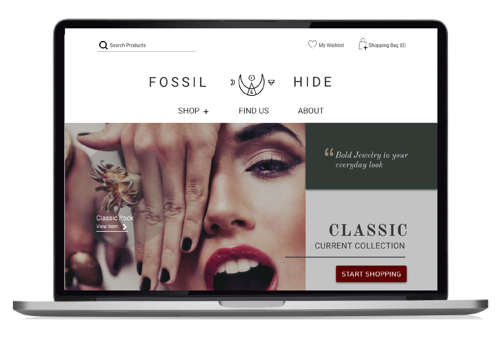
Khadijah Khan - Case Study
archi-uxer medium blogs Case studies about me resume
fossilHome

User Research

rethinking your eCommerce experience

Fossil & Hide is a local Atlanta jewelry business run by Karen Horn and Jenny Watts. The stakeholders shared the need to increase their direct sales and brand awareness. Our team felt the need to provide assistance in achieving their business goals and improving their eCommerce experience.

Problem Statement

Our research showed that Fossil & Hide’s website was not maximizing its opportunity to provide an effortless shopping experience nor exhibit their bold style.

UX Hypothesis

Therefore, we feel it is necessary to add a visual story to each collection and piece released by Fossil & Hide. This form of branding may increase their sales and also showcase the exclusivity of the brand, which is a crucial desire for our stakeholders.

We might achieve this vision by exposing the backstory of our creators, increasing and clarifying the content on each page, and reusing their images in way that will highlight and expose the boldness of their jewelry products. Currently, the images used throughout the website makes a potential user feel as if they are viewing a photographer's portfolio instead of a eCommerce website. These potential ideas will provide Fossil & Hide a stronger digital platform and elevate the reputation of their brand.

fossilMobile

team

Our team consisted of Alda Lee, Nathaniel Higgins and myself. We worked closely together during the research phase so that we could collectively be on the same page and ensure that we all had a unified vision of our core users and the redesign objective. All three of us began the redesign as UX researchers and designers. In order to achieve our goals efficiently and since time was also limited, as a team we were compelled to divide the next two design phases amongst each other. The UI portion was led by Alda and myself, we heavily defined the style, look, and feel of the website. The coding portion was led by Nathaniel who helped bring the design to life. We could not have achieved our vision without teamwork, collaboration and a lot of discussions.

my role

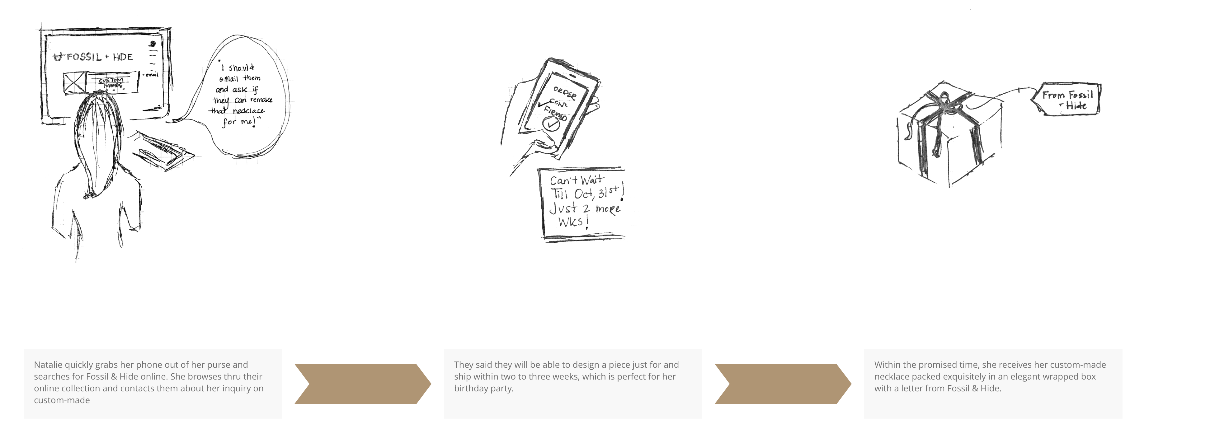
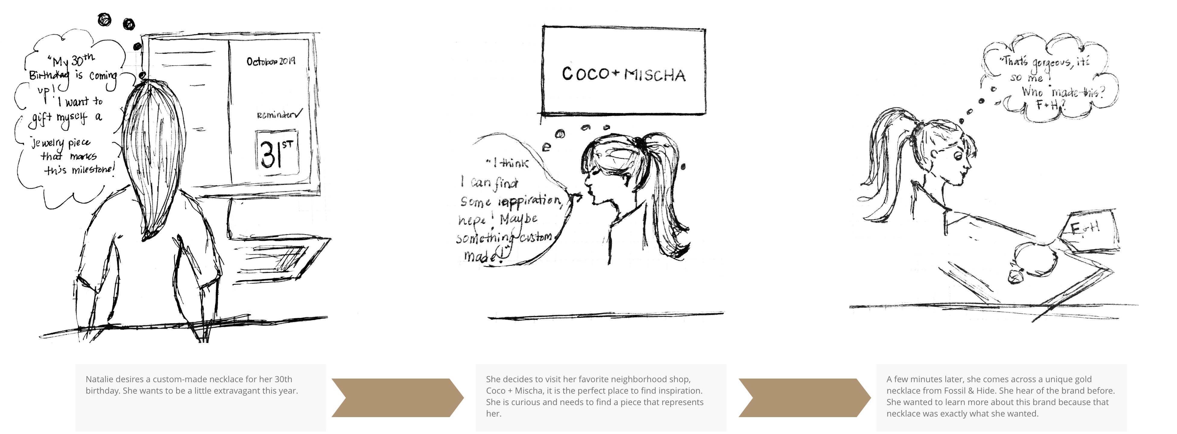
MY ROLE: This was a major project that allowed me to grow as a user experience/interface designer. Redesigning the user interface for an eCommerce site was a challenge that I was ready to tackle.

timeline

We were given approximately 3 weeks to complete all stages of the design process. The scope of the project consisted of redesigning the essential elements of the website.

"This timeline was compounded by all three teammates with full-time jobs, meaning every free moment counted!"

timeline

meet our stakeholders:

Our stakeholders, Jenny and Karen are bold local entrenprenuers in Georgia. Their desire to push the limits is exquistely apparent in the jewelry they create.

User Research: Our Target Users

The Fossil & Hide target users are women in their late-twenties to early forties who desire purchasing jewelry pieces that reflect their indivdualism. A Fossil & Hide user is fully aware of the care and craftmanship of every peice purchased from the company. We found common personality traits amongst our stakeholders and their current consumers. Each woman displayed characteristics of boldness, empowerment and uniqueness.

User Persona

“I believe in cherishing every moment in my life, it is always an opportunity for me to leave behind a dose of my imprint in this world!” - Natalie Rodriguez

userImg
journeyImg
storyImg1
storyImg2

Affinity and Empathy Mapping

The process of affinity diagramming provided us a greater insight on what the majority of our users desired when shopping online for jewlery.

We managed to categorize our findings into 4 major groups:

  • Awareness
  • Consideration
  • Decision-making
  • post-purchase behavior
  • affinity

    business canvas model

    The implementation of a business canvas model replenished a deeper understanding of the stakeholders of Fossil & Hide. As we approached the redesign of the eCommerce experience, it was essential to utilize the diffeent channels that currently brought consumers to the website. Social media and word of mouth played a major role of building the brand. Most of their purchases were completed through Instagram. We wanted to shift that form of purchase to their main website. It was crucial to pull our social media audience and to build a bridge between both platforms.

    Stakeholder's Perspective

    "It gets more traffic when we post about it on social media. Spikes in visitors happens only during those times." - Jenny Watts & Karen Horn Smith

    businessImg

    User Interface

    UI Design Direction

    From the first glance, we felt the current webiste of Fossil & Hide lacked a vibrant presence. Jenny and Karen's mission was not visually communicated, and we felt the need to take a step forward and rethink their digital platform. The UX research provided a greater insight on our user's desires and needs. Now it was our turn to merge our users and stakeholders needs and wants.

    Style Guide

    As a designer, I was extremely excited to add the bold flare of Jenny and Karen's mission. We took the advantage of this opportunity and aimed to provide an appealing experience for our users. Every visual aspect of this website was developed in order to increase interactivity, which was not present in the original design. However, our time was limited and this was our first iteration of the UI phase. With future user testings, we feel that our proposal will maximize user activity.

    styleImg

    Style Guide Direction

    It was important to gather inspiration from other designers. Discovering current trends, as well as our compettion guided our style direction. The user interface for this company is headed towards a minimalistic yet bold online platform. The company builds its brand on empowerment, innovation and exclusivity. Understanding their mission was crucial in our process of choosing the typography, color patterns and form elements.

    styleboard1

    UI Card Styles: The hover hint of purchase

    Exposing and highlighting the jewelry was an important aspect in all of our cards. Each card provided the user an opportunity to hover over the displayed jewelry pieces, which offered them with an option of being directed to the specific page the item was located on.

    hover1Img
    desktop
    Next Case Study